
The Aesthetic and Civilizational Evolution of Arabic Calligraphy: From Sacred Script to Transcultural Artform

This evolution reflects a profound shift: from an early symbolic function reliant on archaic, condensed graphic forms, to a primarily oral function rooted in memorization, rhythm, and cadence. These features are evident in the pre-Islamic poetic tradition, notably in the Muʿallaqāt—epic poems allegedly displayed on the walls of the Kaaba. With the rise of Islam in the 7th century CE, a new sacred function emerged: the calligraphic inscription of the Qur’anic text, characterized by its internal rhythm, repetition, and rhetorical power. This transformation turned the written word into a performative act, conveying both spiritual authority and formal refinement.
The Islamic revelation thus initiated an unprecedented calligraphic momentum. The sacred function of writing required formal codification and stylistic elevation. Yet the development of Arabic calligraphy did not remain confined to religious contexts. It quickly extended to secular domains, including daily transactions, commercial exchanges, and civic administration. The art of writing became central to the production of administrative records, contracts, and treaties. At the same time, its visual potential gave rise to new artistic sensibilities, allowing calligraphers to evolve into full-fledged visual artists, standing alongside painters and decorators in both Islamic and, later, European contexts.
Eastern Flourishing and the Birth of Titular Aesthetics
The swift expansion of Islamic influence beyond the Arabian Peninsula enabled the dissemination of Ḥijāzī scriptural culture and the formation of sacred iconographies—paradoxically through the written word rather than the image, which was largely proscribed in religious art. The prohibition of figuration enhanced the symbolic and aesthetic function of the letter itself. Letterforms thus became both signs and signs of signs—sacred vessels for divine speech and ornamental elements charged with expressive value.
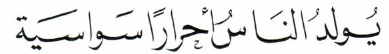
Thuluth script
Among the most prominent developments was the emergence of Thuluth script in Persia. Initially referred to as the “Persian script,” this style was admired for its graceful proportions and fluidity, especially in the elongated end-of-word characters. While its use in Qur’anic manuscripts was generally restricted to surah titles, the basmala, ḥamdala, and final colophons, it played an essential role in manuscript pedagogy—segmenting chapters and marking recitational units. In literary and scholarly works, Thuluth was often employed for frontispieces, dedications, and prologues, thereby elevating the paratext to the status of ornament.
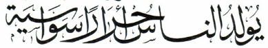
The Kūfic Tradition and the Pursuit of Harmony
As Persian calligraphy flourished in the East, the Kūfic tradition asserted itself across the Arabian Peninsula and the Fertile Crescent. This script—named after the city of Kūfa—became the cornerstone of Islamic calligraphy in its early centuries. It was favored for monumental inscriptions and Qur’anic manuscripts due to its structural rigidity and visual clarity. However, Kūfic was not static. It underwent significant transformations, thanks to the contributions of master calligraphers such as Ibn Muqla and Ibn al-Bawwāb, who played pivotal roles in systematizing the proportional rules of script design.

Kūfic script
Through innovations such as the connection between letters, the balance between horizontal and vertical strokes, and the gradual introduction of diacritical marks, Arabic writing moved from angularity to curvature, from austerity to elegance. These refinements facilitated both reading and copying while simultaneously opening the door to a new calligraphic aesthetics. This shift culminated in the elevation of writing into an art form that transcended its functional origins and entered the realm of visual beauty.
The Ottoman Sulṭānī style, with its gilded and ethereal quality, and the lush, interlaced Fāṭimid scripts of Egypt, exemplify the integration of spiritual authority and ornamental complexity. Meanwhile, Kūfic also explored new artistic horizons, traveling to Europe through Andalusian miniatures and the rich cultural exchanges of al-Andalus. The influence of Arabic script was particularly visible in the architectural embellishments of the Moorish and Sicilian-Arabic styles, where calligraphy merged with arabesque and geometric motifs. Decorative innovations such as tazhīr (floral bordering), taʿshīb (leafing), tawjīh (crowning words), and elaborate geometric compositions positioned calligraphy at the heart of Islamic visual culture.
The Western Turn: Simplicity, Transmission, and Civic Use
The western development of Arabic calligraphy reveals a different dynamic, marked by simplicity and practical application. The Qayrawānī script, prevalent in North Africa during the early Islamic centuries, adopted a restrained visual vocabulary: thickened horizontal strokes, limited curvature, minimal ornamentation, and a deliberate organization of dots. Letters were closely spaced, and forms such as alif and lām were vertically aligned. This pared-down aesthetic gave rise to the Maghribī script, which retained the core traits of simplicity and did not embrace ornamental exuberance until the 15th century CE.
Despite the later addition of red dots and spacing signs to aid reading, Maghribī script generally distanced itself from decorative aims. Instead, it was favored for recording contracts, legal documents, and bureaucratic registers. Its sobriety made it particularly suitable for official and civic uses. Yet its historical role should not be underestimated: Maghribī served as a cultural bridge between the Arabic calligraphic tradition and sub-Saharan African scripts, such as the Sudanese and Timbuktian styles. The latter, known for their rough texture and archaic forms, echo the layered complexity and duality once seen in early Kūfic models.
Andalusian Legacy and the Transcultural Horizon
The case of Andalusian calligraphy deserves special attention. Born at the crossroads of Islamic, Christian, and Jewish civilizations, it embodies the cultural hybridity that characterized al-Andalus. The script developed in this context reflects a sophisticated synthesis of influences: rigorous formal training rooted in Qur’anic calligraphy, a receptiveness to aesthetic experimentation, and exposure to Western visual sensibilities. The result was a body of scriptural art that, while deeply anchored in Islamic traditions, contributed to the broader artistic patrimony of the Mediterranean world.
In sum, the evolution of Arabic calligraphy cannot be reduced to a simple linear development. It is a dynamic interplay of sacred and profane, oral and written, East and West, simplicity and ornament. As a medium of aesthetic, civic, and spiritual expression, Arabic calligraphy stands not merely as a graphic art but as a civilization in itself—an architecture of letters that still speaks across time, languages, and cultures.